

When the Voorall Foundation, together with the City of The Hague, approached us, a project that had been underway for two years had become bogged down in its own complexity. A platform was under development, data had been collected, and resources had been allocated, but the desired results had not materialized. What existed did not function as a product; it was not being used, trusted, or further developed. They therefore asked us to create a digital platform that translates accessibility data into concrete, actionable insights for residents of The Hague.
The original goal was clear and socially relevant. The Hague aims to be a city where everyone can get around, regardless of disability. In practice, this means that residents must be able to assess in advance whether a location is accessible—not in general terms, but specifically and based on factual information. To achieve this, we have developed a platform that enables residents to make well-informed decisions right away.

What is accessible to one person may not be accessible to another.
Accessibility is not a single, universal truth. It depends on physical circumstances, personal limitations, context, time, and interpretation. What is accessible to one person may not be accessible to another. What works today may be different tomorrow. And just because something is technically correct doesn’t mean it’s actually usable.
What we saw is a classic example of how digital projects get bogged down when complexity isn’t clearly taken into account. The data layer had been set up at a basic level, but wasn’t designed for consistent use. Information was fragmented, duplicated, or not standardized. This not only makes management difficult but also directly undermines the reliability of the end product. At the same time, the interface was designed without a clear connection to how different user groups process information.
In addition, there was another factor that is often underestimated in many projects: the differences between target groups are not just a minor detail here, but determine the design. In this context, accessibility means taking into account people with visual, auditory, motor, or cognitive impairments—often in combination. This directly influences the navigation, the organization of information, and the visual design. What is clear to one user may actually create confusion for another. As a result, you cannot design based on an “average” user—there is no such thing here.
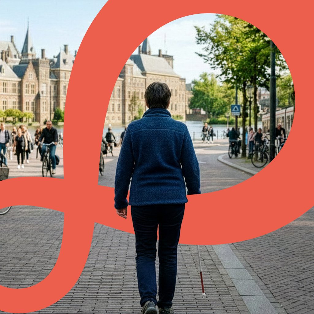

Clarifying Needs and Expectations
First, we worked with the target audience to identify their needs and expectations. These insights formed the basis for data optimization. Based on that analysis, we defined the scope of the functionalities and determined the platform’s architecture.
The second step in this process was therefore not to improve what already existed, but to uncover the underlying structure. That started with the data—not because data is the end product, but because, in this case, the quality of the experience depends entirely on the quality of the information. We analyzed, cleaned up, and restructured the existing database. Duplicate entries were merged, definitions were refined, and the inspection lists were rebuilt. That sounds technical, but in reality, it’s a substantive decision. After all, this is where you determine what “accessibility” means in measurable terms.
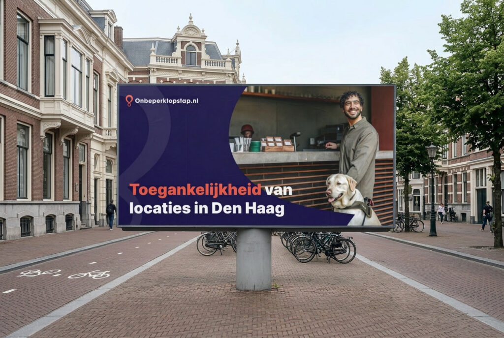
The third step was to develop a visual identity as a functional system
In this project, design was not a byproduct of the product, but an integral part of how the system works. We were responsible for the entire visual identity, from the basic principles to their implementation in the interface.
The challenge was not in creating a distinctive style, but in developing a visual system that makes complex information immediately understandable to a wide range of user groups.
In doing so, we focused on:
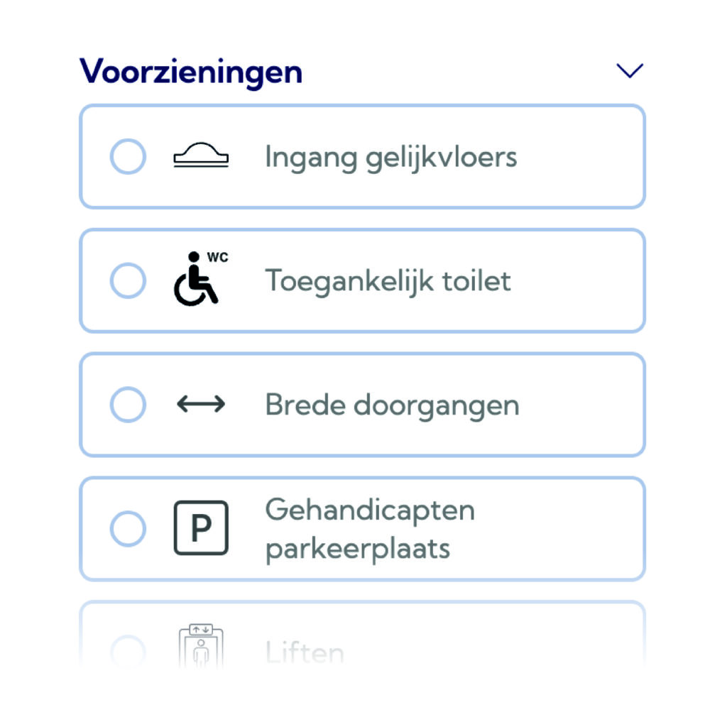
- a consistent and recognizable set of icons for accessibility features
- a clear visual hierarchy that intuitively guides users through information
- Use of color and contrast tailored to different types of visual impairments
- a design that creates a sense of calm and clarity, even when there is a high density of information
The visual identity thus functions not only as an aesthetic layer, but as an essential part of the interaction. It makes information easier to scan, compare, and interpret more quickly. In practical terms, this means that a user doesn’t have to read first to understand, but can immediately assess visually whether a location suits his or her situation.

We worked closely with the target group—not as a form of post-hoc validation, but as an integral part of the process.
During conversations and sessions, it became clear that the problem lies not in a lack of information, but in the way that information is presented. Users don’t want detailed descriptions; they want concrete guidance. They want to be able to trust what they see and base a decision on it immediately.
Instead of a platform that collects and displays information, we’ve been working on a system that facilitates decision-making. That calls for a different approach to design—no longer thinking in terms of pages or features, but in terms of usage moments. This approach is reflected in the way information is presented. Iconography, hierarchy, and visual consistency play a central role in this. By standardizing information and encoding it visually, we create a system that is easier to understand than textual explanations.
The balance between simplicity and comprehensiveness
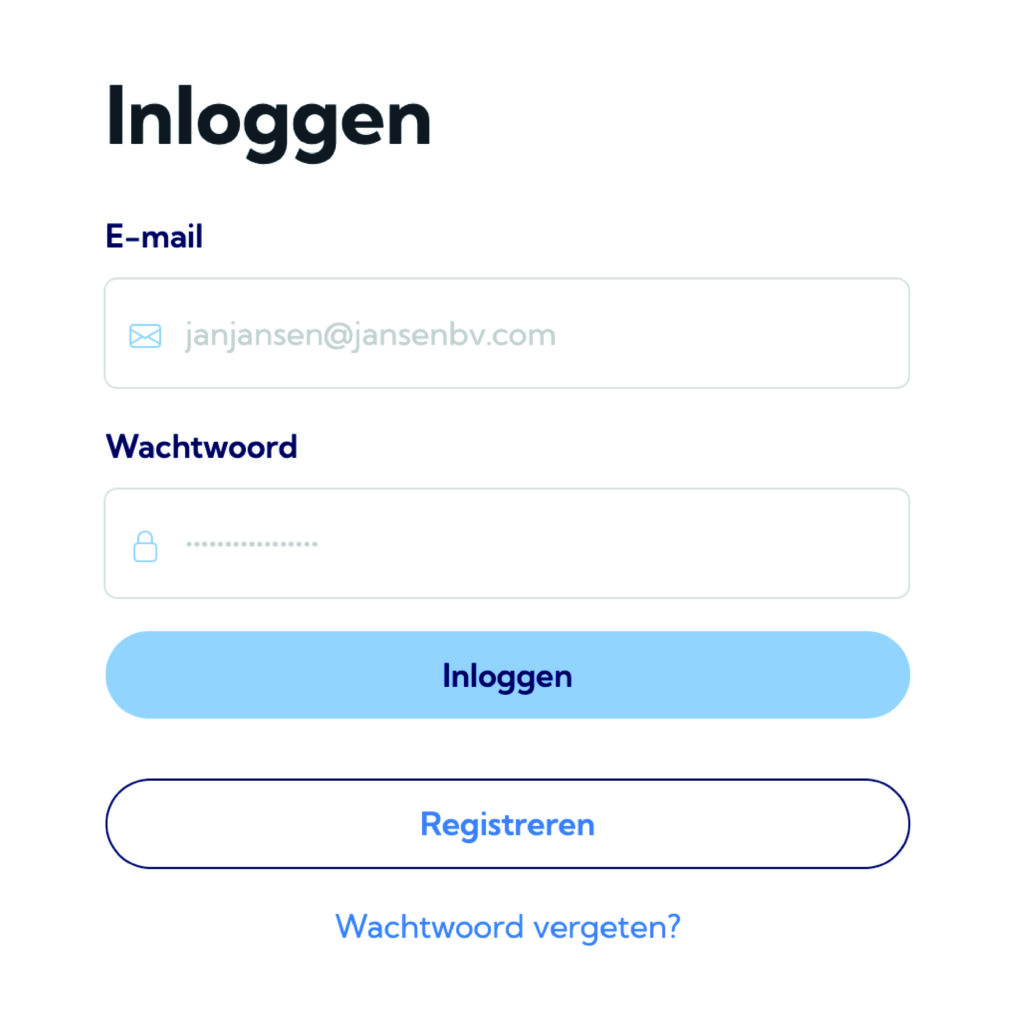
A second challenge was personalization. Research showed that users need to be able to save their preferences so they don’t have to specify what to take into account every single time. At the same time, this is not automatically permitted in a government context due to privacy laws. Instead of solving this with complex account structures, we opted for a flexible system in which the user determines what is relevant
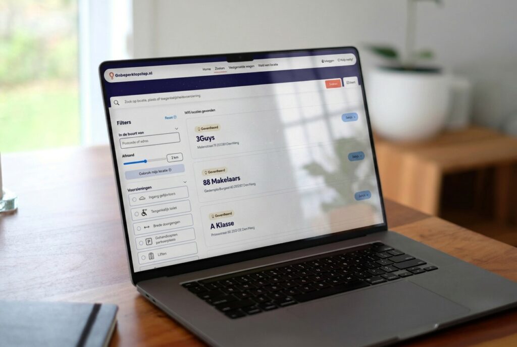
For a target audience that already faces obstacles in the physical world, a digital product must do exactly the opposite. That means every extra step, every mandatory registration, or every unclear interaction has a direct negative impact. The decision to make the platform immediately accessible without requiring accounts is therefore not a convenience feature, but a fundamental part of the strategy.

Technically, the platform was designed as a custom solution within a flexible CMS, with the data layer and the front end closely integrated.
The structure is designed in such a way that expansion remains possible, for example, toward mobile applications or additional modules. This future-proof approach is essential in a context where both policy and user needs are constantly changing.
For users, this means they are less dependent on outside help and can make choices with greater confidence. For the municipality, it means that accessibility is no longer an abstract policy goal, but something that becomes visible and measurable. And perhaps even more importantly, it highlights where improvements are needed, allowing the platform to indirectly contribute to a better physical environment.
For us, this process confirms what we believe in. Complexity isn’t a problem you solve by avoiding it. It’s something you need to understand, structure, and translate. Only then does space open up for simplicity that actually works. When you’re working on a platform where complexity, various stakeholders, and real user needs come together, the challenge rarely lies in what you build, but in how you approach it.
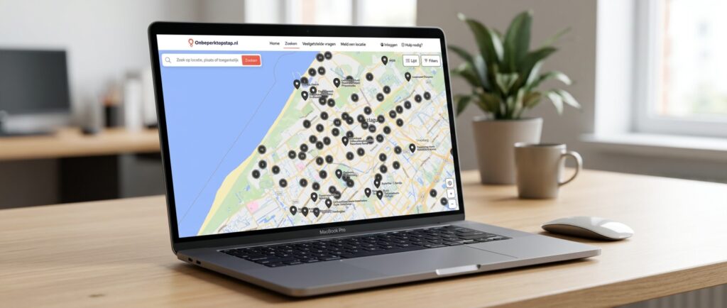
Curious to see what the platform looks like?
We offer this platform to municipalities, foundations, and other organizations that want to become more inclusive and accessible. Are you curious about the possibilities? Feel free to contact us with no obligation. Together, we’re working toward a world where everyone can participate fully.

