

Een huisstijl lijkt op het eerste gezicht vooral iets visueels. Je denkt aan een logo, een kleurenpalet, typografie, fotografie en templates. Zolang de middelen er professioneel uitzien, lijkt er weinig aan de hand. Toch zien we bij Piranha vaak dat een inconsistente huisstijl veel meer kost dan organisaties vooraf inschatten.
These costs do not only affect how the brand looks. They also influence how people recognise, trust and use it. What begins as a small inconsistency in a presentation can gradually develop into a brand that feels less focused and less convincing. Not because of one major problem, but because many small differences combine to create a fragmented and unsettled impression.
Recognition is built through repetition. When customers consistently encounter the same visual cues, they form a clear impression of your organisation more quickly. Once that visual consistency begins to shift, recognition gradually fades. The website may feel carefully designed, while the proposal does not reflect the same standard. A presentation may have a different look and feel from the brochure, while a social media post appears to follow yet another style. Individually, these may seem like minor differences, but together they create uncertainty. The brand feels less cohesive and, as a result, less powerful.

People judge organisations not only by what they say, but also by how carefully and professionally they present themselves.
When communication materials do not align, they can raise questions. Is this information still accurate? Is this the same organisation? Do these people work professionally? Especially when it comes to complex services, technical products or significant investments, that impression plays an important role.
When that translation falls short, tension arises between what an organisation says and what it shows. A company that positions itself as forward-thinking but still relies on outdated templates weakens its own message. An organisation that wants to inspire trust but sends documents that feel inconsistent or poorly structured becomes less convincing. Professionalism is not defined by a strong logo alone, but by the coherence between every brand touchpoint.
An inconsistent brand identity also takes up a great deal of time.
Without clear guidelines, teams start creating their own solutions. Sales adapts presentations based on personal preference, HR uses slightly different formats, and marketing continues to correct individual files. Meanwhile, project teams search for the correct logo, colour or most recent template. As a result, every new piece of communication becomes a small design process in itself.
That is why, at Piranha, we prefer to make brand identities practical. A brand manual that sits unused in a folder makes little difference. A visual identity needs to work in everyday practice. Only when people understand the style and can apply it easily does it become a system that supports them rather than slows them down.
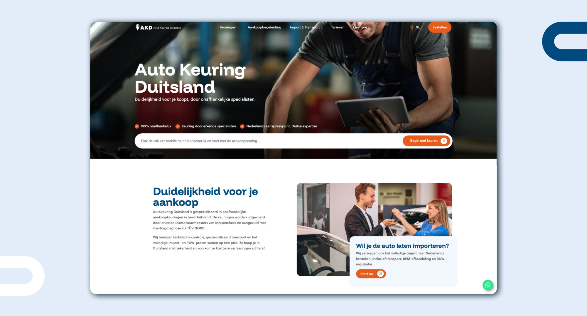
A well-structured brand identity makes collaboration easier.
A clear visual identity also makes a significant difference when working with external partners. Many organisations collaborate with designers, developers, photographers, copywriters, printers or marketing agencies. Without a clearly defined system, each party has to interpret the brand from scratch. This often results in additional rounds of revisions and longer lead times. Not because those partners are not doing their job well, but because the foundation is missing.
The challenge with inconsistency is that its impact usually develops gradually. No one immediately notices that a brand is being weakened by a single incorrect colour, a misplaced image or a presentation that feels slightly off. Over time, however, these inconsistencies begin to accumulate. The communication gradually feels less distinctive, less coherent and less professional, without it being immediately clear what is causing the problem.
Creativity Within a Consistent Framework
Consistency does not mean that everything has to look the same. A campaign can be more expressive than a proposal, and a social media post can be more playful than a white paper. A strong visual identity creates room for variation, as long as every expression is recognisably part of the same brand world. Its strength lies in design principles that are robust enough to provide direction, yet flexible enough to adapt to different applications.
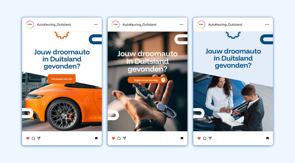
An effective visual identity therefore consists of more than just a logo and a colour palette.
At Piranha, we develop brands that remain strong in practice. Brands that are understood internally, recognised externally and able to grow alongside the organisation.
Taking your visual identity seriously is therefore not simply an investment in making your brand look better. It is an investment in a brand that communicates more clearly, is easier to use and can grow more effectively alongside the organisation. Consistency is not merely a detail for the design department, but a strategic foundation for how your organisation is seen, understood and remembered.
Want to know how we build brands?
Would you like to know how we build consistent brands? Explore our approach
Looking for more information Get in touch

